Sunday, February 26, 2012

Week6- Marathon, Florida - Crossing the finish line last ain't so bad.

Learning Illustrator was our goal.  When we learn a new game learning the foundational steps is paramount. 
It took finding several more illustrator tutorial sites to find the basics to get started on this one.


 How I composed this map.  We were given a base map of just the islands in a very pale nearly invisible appearance and a list of items to locate and label. 
1.      Opened map using AI
2.      Without any background other than what we have learned and a few tutorials, my skills  to start from a nearly new document were null.  Searched first to change paper orientation, help menu wasn’t much help (my frustration level was already up).   File>new  (the label is not labeled but was a picture that did not represent a paper shape to me). 
3.      Opened document to check out layer structure. 
4.      Using select>transformations. I was able to nudge the islands, down vertically and left horizontally.
5.      Put rulers and grid on document. Created neatline by select>rectangle. Started on top left corner of document came across entire artboard. Opened color pallet, experimented lots here. Got stuck, watched tutorials, ones I found started in middle of shapes, etc.  Had to learn about color pallet, kuler, etc. used up lots of time here.   Eventually, created color pallet: beach, nature, water, several others.  Chose gradient as base, fiddled up lots of time and trials here. Satisfied with results. Transformed it to back of artboard, islands came back up. Locked it down.
6.      Chose to recolor islands. Opened layer, renamed group for clarity. Selected entire island group, filled color, chose stroke color. Locked it down.
7.      Located items for identification on Google Earth, used USPS site for zip code location for the cities. 
8.      Printed base map as shell to create layout for map. Made outline of layers, tasks to accomplish (some of these are for tutorial searches.
9.      Created layers for North Arrow, Neatline, Cities, Water bodies, Legend/Symbols, Island Names.
10.  Opened layer for Island Names, began with select>type began typing names near their locations. Set font as Calibri, regular, size 9.  All names are initially horizontal.   Tried to type on path, keep getting error- must type on non-compound, non masking path. Have no idea what this means.
11.  Opened Window>symbols>found basic library. Began building symbol inventory for legend. Included part of North Arrow.
12.  Opened North Arrow layer, dragged arrow symbol into map. Select>type>N . Created North Arrow group.  Placed it in general area.
13.  Placed symbols for airport, nature center, golf course on map and in legend layer on second place on map for building legend.
14.  Placed cities symbol in location identified by USPS.  Typed city name on Map near symbol. Used Calibri, size 12.  Placed city symbol in legend area.
15.  Began to place island labels in correct location. Got frustrated trying type path thing, chose to place type in safe location on map, then select, drag, then rotate text as needed for desired placement.
16.  Checked off all labels except Florida Bay & Atlantic Ocean. Typed these in clear location on map, Cambri, Italic, size 36, later determined need 30.  Transparency to 25%. Color pallet, dark blue.
17.  For Name, date, source, select>rounded rectangle, color palette, sandish color. Type Calibri, size 8, regular. Created group, moved to desired location, locked it down.
18.  Opened Legend layer, select >type, cities, Airport, Nature Center, Golf Course. Selected whole area with symbols-labels, made group, moved to desired location. Locked it down.
19.  For title box, opened layer, select>ellipse. Filled color, stroke.  Select>type typed title and subtitle. Created group for ease of placement.  
20.  Saved document throughout.   Saved it as s:\cartography|week6Typography\Week6TypographyFLAKey_kfm4.
21.  Problems encountered were just the perfect storm.  Friday’s severe thunderstorms and internet interruptions, throughout.  Difficulty with basic illustrator skills since I had absolutely no background with any other similar drawing or graphics program other than what we had done in two classes. (Not quite enough information).  Starting a document from nearly scratch was extremely intimidating.  Highest work load at crunch time of deadline. Did not count on weather, etc.  It was a humbling melting experience.    Key to overcoming was just to accept assignment would be late, find lots of tutorials, best one was www.vectordiary.com  best 30 day crash start. (Did not pay for use, found way in the free stuff).  It contained the extreme basics of illustrator, going over the basic tools as if I knew nothing . However, it did not cover how to start from completely new page, found that on another site to set artboard. 

I spent 3-4 hours or more fussing over stuff to get started before I found the vectorydiary site, however, after an hour of practice from the vectordiary site, I was able to complete the lab in just over 7 hours, which was remarkable.

Thursday, February 23, 2012

Line um up! Week6-Projecting Maps one on another

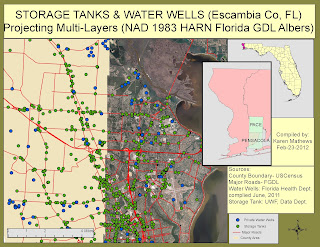
This week the computer and I have been wrestling with "??"  I've always blamed computer issues on sunspots. One day I'll be proven there's more to it than just words.  Anyhow, combining several maps from several sources is no easy task. This lesson was a strong one for developing precepts. These are foundational to the future. Soaking in the steps was crucial for success.    For me this was a brain teaser.   Some colleagues had dots in the Gulf, mine were in piles knotted up.  Once we figured out how to spread the dots, getting them to land was a breeze.   For those following me, the process summary may bore you. It's long.    


Process Summary Details
Read through lab before starting. Created  file folder for FLADATAlayers (sub files aerial, topo), under aerial as each needed, file for each quad: ie, Pace 5258, etc.
1)      See that a chart would be helpful for the geo coordination information on each layer file. It is at the end of this process summary along with list of file paths.
2)      Opened Labins.org, bookmarked for later>DOQQ>2004 RGB Albers Units:MT MrSID. Read info took notes. >Quad Name locator>search Cantonment  back out to Florida Quad Map.  I was not able to engage zoom so used percentage in/out to locate.  Cantonment Quad 5359 (usga 30087-E3) counties Santa Rosa/Escambia/  usgs 250k-Pensacola/ usgs 100k-Bay Minette. 
3)      Back out to 2004----, >Enter FPT site. Down to q53. Not able to download from my computer to S:drive in school site.  Reentered FTP using edesktop, internet exployer then to s:\FLADATAlayers\FLAaerials moved over .sid and sdw files into s:\. Saw all 8 on download list.
File path:       S:\ introgis\Week6ProjectionsII\FLA_usgsaerials\q5359ne.swd (each individually into same path) These were individual 8 files: q5359ne.swd: q5359ne.sid: q5359nw.sdw:  q5359nw.sid: q5359se.sdw:  q5359se.sid:  q5359sw.sdw: q5359sw.sid
4) Used the internet exployer portal through edesktop on this practice exercise). My files did not export into edesktop properly.  (I had posted some discussion issues these were discovered after I had completed Part 1, Steps 1-3( thru subpart 15)).
5)      Followed Lab instructions through Step 3 to define spatial reference for each q5359xx.sid file for the Cantonment quad.  At Step3 (15), I did not have a scale and unknown units. Went ahead and added base map. It had a red (x) and would not load. 
6) Message box for Unknown Spacial Reference came up, followed directions for defining spatial reference for each of the q5259xx.sid files.  Did not see the .sdw ext for same quad files. 
Path for the defining.  On file>properties>scroll to spatial reference (undefined)>select> projected coordinate systems>state systems> NAD 1983 HARN Florida GDL Albers(Meters).prj for each of the 4 quads.

7.  Struggled here deleted, came back still same thing. Posted on discussion, ugh.  Never came up with meters, but coordinates on bar were nearly in same range as suggested, so I was not off completely.  Had unknown units  Went ahead and added Basemap from Bing aerials, basemap layered on TOC but did not show up on map. (Had a little red (x) beside it).
8.  Step 4. Decided to try another way to get data.  Entered labins.org from my personal computer internet portal, >DRG>stateplane-NAD 83 TIFF-Collars removed>Enter FTP>North> copied both  mrg5353.tfw & mrg5358.tif onto jump drive,  closed Labins.org   Opened filezilla>sitemanager>edesktop>s:\introgis\week6projectionsll\FLA_usgstopo\ mrg5358.tif then mrg5358.tfw, watched each until they downloaded. 
9. Followed my PS notes for changing spatial reference>undefined>select>projected coordinate systems> to stateplane/NAD 1983 (usfeet),  (projection was Lambert Conformal Conic/False easting 1968500. Central meridian 84.5/Standard parallel 1: 29,583333, parallel 2 30.75  Linear foot us (0.304801) GCS North American 1983, Datum D north American 1983, spheroid GRS 1980.
10. Added to Arcmap. Pressed yes for pyramids.   IT WORKED, YEA, DANCING.  Yes. Scale 1: 104,643, on full extent. Added basemap, YEA……….    Change was internet portal entrance & moving files by stick, allowing full time for download like regular thing.  (Made a discussion note hoping my issue could help another.)
11.  County Boundary file, to FGDL. Followed instructions, just used jump drive to move as above,  downloaded & moved quad index same way. Too tired reading lab did not realize needed to download on our map.   (file renamed to FLAusgaquad1-24k)  File properties on chart at end for both of these. Used new folder for FLADATAlayers for both of these. Same with for major roads file.
12.  Had no troubles with excel sheet, creating columns, Placed DD conversion formula in without difficulty.  Added data to arcmap, defined coordinate system>world>wGS 1984.prj not a selection, chose WGS 1984 world Mercator instead. Problem not the projection but finding the dots on my map.  If I tried to move them around or full extent they were gone.  Did this couple of times until had them still (not moving) on page.  File path:  s:\introgis\week6projectionsII\3Eaglenest.shp 
13. Began final map.  Opened EscambiaSTMC.xls, added columns for xcoord & ycoord.  Entered formulas for conversion to Decimal Degrees.  Completed this resaved as Escam_storage_tankinfo.xls  was sure to use excel 97-2003 workbook.  Path: s:\introgis\week6projectionsII_week6storagetankmap\...
14. Opened Arcmap,new map, file>add data>addxydata>xycoordinate system>Geographic coordinate system>world>add>wcs 1984.prj  somehow was able to transform this one. Screen shot of final projection included in dropbox for viewing.  Realized the dot file was not the one to put on map as first layer. 
15.  Viewed quad graphic for which aerial set to juxtapose to Pace, Pensacola. Both in UTM16N, with NAD 83/Florida North (ft)US. Iin Labins, DOQQ, downloaded Pensacola quads5258 with all sdw & sid extensions. File path s:\intro\week6projections\FLA-usgsaerials\Pace5358 (all 8 quads downloaded) & \Pensacola5258 (all 8 quads downloaded to personal jump) Filezilla, moved all 16 files over to edesktop. Key to this, download takes a while, don’t rush it.
16.  Added data using Escam_storage_tank.xls.xlm to map. Fell in place fine. Converted GSC with warning as suggested in discussion and from projections1. Renamed xls sheet to tanklocation.  Made separate map for tankdotsyea.mxd for practice before adding layer.
17. Added layer, majrds.shp, added cntband.shp.  Both of these have GCS Albers which matched aerials.
18.  Chose to add extra layer showing water wells which added punch to point of contamination. Found on fDGL  well study by Florida Department Environmental Protection, downloaded to blank map to work on. In attribute table found county name, selected by attribute dialogSQL> “county”=’escambia’>verify ok>
        Made new layer>data>export data>selected features>this layers data source>output>s:\FLADatalayers\wellwtr_escambiaCo.  Renamed later to Escambia_Co_wells.shp file imported to map.   Converted GSC  warning> GCS GSC_wgs_1984>transformations>dialog>choices convert GSC 2GS 1984>into NorthAmerica|NAD 1983>using choices>NAD 1983 to WGS 1984-5>ok. YEA made blue dots for wells.   
19. Used this same path to transform the tankdots but could not find my information earlier.  Did not use defaults as suggested in lab used WSG 1984.prj to make it work on map.
20.  Just last added quad graph. Put it in Escambia county inset, labeled features, set transparency so part of underneath could be seen. Had to make extension adjustments for clipping for it to show.
21.   Made inset with Florida and Escambia highlighted.
22.  Added rectangles for title, date, data source, added legend, scale, north arrow. Had papersource issues with printer when needed to change orientation to landscape.
23.   Somewhere in process changed name of layers in TOC to pace.. and now can not get coordinate system tab to show.  Included screen shot.  Made several screenshots of GSC for several layers to show put these in dropbox.
24. Computer issues so slow and freezing up, unable to fine tune Escambia inset anymore afraid will lose it all.  Better get it in while I can.   To combat freezing up: unselected all layers in frames other than one I was working it.  Screen would fade away with any click of mouse.  Glad I have a product to turn in.

Saturday, February 18, 2012

Map Compositon- There's more to it than it looks!!!!!

Getting the parts of a map to blend is much like making a cake. There is a recipe (procedure) to follow. Apparently, parts of the recipe remain as "family secrets".  I hope to discover more of them as time progresses. Until then, paying attention to the details remain important.  This composition felt more like an experiment in clicking on this or that to see what it did than composing a map.  Learning Adobe Illustrator continues to be a moving challenge.  

It seemed like the Process Summary was more like a novel than a short recipe card.  Looks like the neatline was lost in translation, oh well, this was not easy come, cause it went.


Process Summary  Week 5- Map Composition (Hispanic Pop. S.FL)
1.      This one began innocently enough as an import from R:drive to S:drive in the Week5-Map Composition folder.  Opened it in Adobe Illustrator to see 3 maps, and elements jumbled around.
2.      Saved a copy of the original document as Florida_hispanic2.ai before I began to modify map.
3.      Began to make rectangle, after having difficulty removed it, started over with same file by opening layers to see where everything was. Created new layer for neatline,  stumbled around with the rectangle eventually had one in the neatline layer. (3rd map with rectangle in NW corner of pic made it fit within just minutes).
4.      Renamed several groups  in various layers for clarity before adjusting any. Ended up with Scale Bar Group in Florida Hispanic. Florida County Bnd layers for single map of Florida.  Made layer for North Arrow, then a group with the North Arrow and N so they would move together.
5.      Rearranged the elements inside the Legend layer, for single grouping. Alternated removing visual (eye) and selecting boxes to narrow which boxes needed to be removed to have one layer box.  Put with  single title label, all colors and measurements in one place. This worked well when changing colors of layers in excerpt map. 
6.      Discovered the isolate mode on layers box (on far top right corner. Used it to isolate counties with shift to highlight counties in groupings for color adjustment.  All counties did not highlight well. Did this at the end and document and I locked up on one another.  Did save doc after each successful change. Which was a keeper later.  (3rd time, still had issues with this step, but was able to work through it to change percentage colors. Added rectangle around Legend, color choice was wrong. One of my percentage layer choices melted into background. Plan B, there.  Still in 3rd try, restarted document lost a couple of the <path> color boxes. In Layers, copied a good <path> color box, moved it in. Was able to recolor). Tried to align legend several ways, watched several videos, not successful. 
7.      Made sublayer group of boxes & percentages in Legend. This assisted in changing colors so that they could be locked when adjusting one without disturbing others.   In Legend on 3rd time, in Type, found dialog box to resize percentage numbers consistently large enough to read.  Also, used transform, scale to increase size of legend to readable size.
8.      On US map, found a way to highlight single State of Florida through grouping and pointing & removing element. Isolated Florida, selected it and changed color to highlight it.  Somehow found out how to  adjust opaqueness of US and fill to enhance its presence on map.  Deleted Alaska & Hawaii since they were extra, took up space and were not part of our study.  Put a grouping around US lower 48, somehow stumbled into the filling area. Was not able to duplicate it as desired later.   Discovered, I had 3 parts to USA section, created group of rectangle, file & states. This worked as unit to move & resize.
9.      Tried to highlight the Florida single inset, was tangled in the color zone with gradients, somehow ended up with a raster, outlined the counties, looked cool but not able to find how to get it to stop. Had issues, just saved and ate supper for strength. On 3rd try left this locked and just moved it around.  Let this dog lie.
10.  Added a title layer,  selected title mode, typed title, made rectangle, put these both in title layer, lost title somewhere in another layer.  Eventually found it.  Added Name, date, source type at bottom. 
11.  Rechecked my map for export and wham. Part of my Florida raster map was gone, the artboard shape changed and ugh. No time to start over.  It’s not my best, it’s not what I wanted, so I’m turning it in not to miss the deadline.   Will try again another time. Saw I had a few more days. When I stared on 3rd time whole raster appeared. See 9.
12.  Many times used notes from Week4 for reference. Watched extra segments on Adobe.tv for selecting, layers, grouping etc.  Some were easier to follow than others.  Best thing. Saved this map often.

Thursday, February 16, 2012

Week5- Queensland, Australia Flooding brings back memories

In addition to our projections lab we were "let loose" so to speak on a nearly adventurous
trip to Queensland, Australia to check out their flooding situation.   Even though my GIS experience
is limited my personal experience with flooding is still too familiar.  Some others may have
also experienced this traumatic event. Some floods come slowly, building over time.
Our July 4th, 1994 in Macon, Georgia came with no fireworks. It came with Alberta a minimum tropical storm out of the Gulf of Mexico. In two days over 25 recorded inches of rain fell near us (neighbors rain gauge). A major dam broke north of Macon during the night, sending a 30-40 foot wall of water towards our town.  Only the crisscross of Interstate 16 & 75 with the steep side of the cemetery hill kept it from taking over.   We were without water for eight weeks; they put porta pottys on the streets for apartments and businesses to use.  Getting around the damaged bridges was a pain.
With these thoughts in mind, I found a fairly new interactive map that Queensland has put into place. it shows their road conditions, traffic issues, construction road sites.   By clicking on the first layer of markers, it tells you how many incidents there are in the area. Enlarging the map, click again,an individual marker comes up (ie) on a road telling you real time conditions, passibility, construction status and when they will check again on the road status.  It was current within several hours of today.
Here's a screenshot:      www.QLDAlert.com/road-closures-map

The map was enlarged from a full view of all of Australia (enlarging scale on left side) to show
north eastern tip of Queensland on east coast paralleling Great Barrier Reef.  Markers are
reflecting real time road conditions and closures,  Closed roads were in brown.  The northern
most brown road is Penisula Developmential Rd.

Week 5 Projections Part I

Nearly a third of our way through this first semester.  It's going by faster than we realize.

Our goal with the projection study is to recognize our earth has no perfect shape and that no matter which direction we look at it, its' gonna wobble. The key is learning how to frame our perspective from an accurate, realistic view. We are to especially recognize that one can not cut up our round earth (like a basketball), lay it flat like a pancake on a piece of paper and expect it to be accurately whole,  without wrinkles.   Thus, the scientist made projections.     Here's our study of Florida using three different projection angles. 


Following is how I made this map.

Process Summary

1)    1)  Moved ProjectionsPartI from R:drive to S:drive, created folder for Week5-ProjectionsI-QueensFlood.  Extracted all files into new file.
2)   2)   Opened ArcCatalog in second window, copy & moved cntbnd.shp to new map document.
3)   3)   Opened toolbox, Data Management Toolbox, Projections and Transformation, Feature, Project.
4)      In Project dialog box, set cntbnd as Input dataset, set cntbnd_utm16 in my S:/Intro/Week5_projectionsI/projectionspartI folder. 
5)     4) Still in Project dialog box, in Output Coordinate System field, accessing Spatial Reference Properties dialog- select- Browse Coordinate System window, navigated to Projected Coordinate Systems folder to UTM then NAD 1983, then selected NAD 1983 UTM Zone 16N, add. In Geographic Transformation drop selected NAD_1983_To_HARN_Florida.  OK, calculating.
6)     5)  Green checkmark. Yea!
7)     6)  Added cntbnd_utm16 to map. Saved map as Week5-Florida_project1.  Warning did not come up.
8)     7)  Inserted two new data frames into map.  Renamed original layer as Albers, 2nd layer as UTM & last layer as StatePlaneN.  Moved cntbnd_utm16 into UTM layer. Deleted it from Albers layer.
9)     8)  In UTM layer, Began at 3 above, Project tool, had created this layer with original cntbnd layer as input followed  with Florida State Plane North (Harn feet) projection (Projected Coordinate Systems>State Plane> NAD 1983 HARN (US feet)   Saved created file as cntbnd_stateplanen added to layer State Plane N.  
10 9)  In layout view, moved three maps beside one another to view.  
1110)  On Albers data frame, activated, attribute table, added field in dialog box “AREA”, short integer as type. OK, on AREA column, click dropdown- selected calculate geometry, yes on warning box, in Calculate Geometry dialog box- AREA as property, use coordinate system of data source (Albers) units- changed to square miles. Ok
1211)  Repeated 11 for layer UTM and StatePlaneN.  Discovered later I forgot to save file after Albers layer, had to redo the steps to input information for chart.
1312)  The above went very smooth and quickly.  It was creating map that bogged me down. Had to rediscover how to select multiple attribute rows not contiguous with no relationships.  Tried Select by: attribute box had right syntax but wrong approach. Later (much later) in attribute table, used control key to select counties- Alachua, Escambia, Polk & Miami-Dade.  
1413)  Created separate layer for selected counties. Changed select color to one more visible with border at 0.40.   Activated label feature for the selected county layer, converted labels to annotations to manipulate labels to best view and uniform appearance for greater comparison on each map.Decided this was best presentation for comparison purposes. (Instead of different color for each county).
1514)  Created data table in Excel with values for comparison projections, imported to map. 
1615)  On each map renamed layers for legend, gap 5, re-sized patch to 15: 7.5 ratio for each entry. Inserted North Arrow (2 looked more symmetrical), added scale bar.  For each map activated, full extent to find best scale ratio- chose 1:10,000,000 as best view for all. Could not do full extent afterwards; it changed ratio so set 1:10,000,000 as default on all three maps.  Albers Map the projection is curved so adjusted fit inside border for best view.
1716)  Inserted titles in each map, drew rectangle box for full map title, selected background, inserted title, used title dialog box for best insertion.  Added neatline around all elements with background color.   17) Straightened appearence.  18) Nearly forgot to put it on blog for assignment.


Sunday, February 12, 2012

Week 4- Adobe Illustrator & GIS What a pair!

When it comes to designing maps, the addition of Adobe Illustrator to the tool box is gigantic.  Once again we are on the journey of learning yet another software program.   It will be the sport of the year to watch our leaps and bounds in real productivity visual progression.   With this one I had some issues from the start.  I've added a few screen shots to show what happened.   
Opps its too small. 


1.      Process Summary Description
1)      Opened ArcCatalog tree to Intro, Week2- Own Your Map, opened each layer file cntbnd_jun11 and cities_feb04 to obtain metadata.  Copied each of these in ArcMap in new map from Intro, Week2 to new folder Cart file, week4_AdobeILL  for lab.
2)      In ArcMap, new map with two layers as new map. Save new map as Week4CART_AdobeILL_kfm4. Renamed both layers: Cities, County Boundary. Changed size of City to #3. Changed shape of county boundary to rounded corner rectangle.  
3)      Inserted Neatline with gap of 10.  Zoomed to Full extent to spread map out.
4)      Inserted scale bar, graphic and inserted scale.  Saved, viewed 100% to see that scale bar was in even numbers.
5)      Inserted Legend with wizard, deleted name Legend, added border, changed size of county shape to 15:7.5 ratio, gap of 5, chose background.
6)      Inserted North Arrow style.
7)      In layout view repositioned map elements to good location. 
8)      Saved map again, as AI, file, exported to S:drive  in Cart/week4/Week4CART_AdobeILL_kfm4.  Closed ArcMap.
9)      Opened Adobe Illustrator, error message was there as anticipated, chose update.
Map opened.  Found fit to screen resized map. 
10)   Opened Layers, initially did not see that I did not have “other 3” layer. Carried on lab plan without it not knowing the consequences ahead. Changed “other” to Neatline. 
11)  Added layer for legend & North Arrow, renamed layers as they appeared. Here is where I began to open and study the structure of the layers with their <group> and clipping path designations.  My layers did not look the same. I moved the layers box off of my map area and saw that the cities were sitting out in the ocean area not on land.  Decided the two issues of missing layers and floating cities were too much. Saved, closed and proceeded to start over with a new map in ArcMap.
12)  Went through the same procedures again with steps 1-9 above.  Second try still did not have “other 3” layer. 
13)  Opened up each layer and the sublayer components to study the structure. 
14)   My “other 2” contained the legend, scale and scale bar without the group and clipping path stuff. On my first map setting up the layers, I did not know that this mattered.   
15)  Added sublayers under “other 2” for North Arrow and scale.  (Found out later, one thing can not be a group). Moved North Arrow element into its layer. Moved scale into its layer. I recolored these layers and locked them.
16)   After all is said and done with the layers, I eventually added a layer, for the scale bar, moving each individual part of the scale bar into it. The subparts of the scale bar did not have a group/clipping path designation.  At the time of this typing, I’ve not been successful at creating a <group> for the scale bar elements. I named a sublayer group but not sure that was the way to handle it.   For this assignment it will remain hanging. However, it’s a “thing” to be conquered which shall not remain untamed.
17)  Here is my screen shot of the converted layers each time I moved a map from ArcMap into AdobeIllustrator.
18) 
19)   I learned to minimize the layer box which helped later.
20)   Inserted a new layer for the legend, recolored it. Moved all the parts into the new layer. Clicked on the circle, the layer was selected. Used the select tool and direct select tool. Bounded boxes came on legend. I was able to move it to the other side of my map.  Somehow, I clicked the wrong direction moving it and it became rotated.  I was able to get it nearly straight.
21)  Selected the text tool from toolbar. Used character top menu to enlarge title words “Florida Cities”.  They were across the map. Made layer for Title, put words into layer, then clicked select circle to make words move around.  Found angle dialog box, moved to 60* (This actually took some trial & error for final results).
22) 
23)   Made sublayer for Name-date-data source. Used text tool & paragraph from top menu to wrap information.  Selected layer to move into place on map.
24)  Went back to layer issue. Cities were not showing up. Moved cities up above counties, they appeared.
25)  Attempting to click and select to see if counties, cities and scalebar were in right place I lost a county and have a city highlighted.  Was not able to backtrace steps to correct.
26)   Found that once I fixed something it was advisable to lock it. Keeps from making errors.
27)   Found object on top menu, tried to make group fixes. Not quite successful. Will conquer this one soon.